
How to Edit Images for a Blog: The Ultimate Guide
Learn how to edit images for a blog the right way: sizes, crops, formats, compression, featured images, mobile prep, and image SEO — with browser tools for each step.
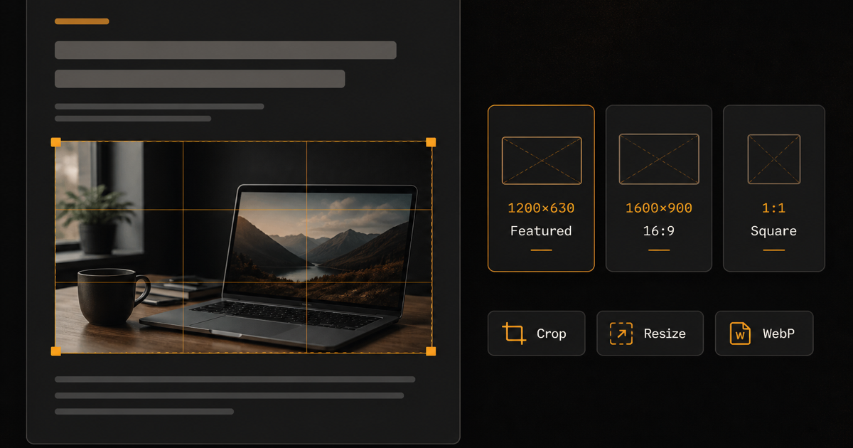
A blog post can be well written and still feel unfinished if the images are stretched, oversized, or inconsistently framed. Readers notice soft, pixelated graphics. Search engines and page-speed tools notice multi-megabyte uploads that block rendering on mobile.
This guide walks through how to edit images for a blog from first principles: choose dimensions that match your content width, crop for composition, pick the right format, reduce file size without wrecking quality, and prepare featured images that still look sharp when shared. Reels Editor is a free, browser-based toolkit for many of these steps — resize, crop, blur, pixelate, remove backgrounds, and convert formats — with processing that stays on your device and no account required.
Use the sections below as a reference when you publish. You do not need every tool for every image; you need a repeatable workflow so every post ships with images that match your brand and your site’s layout.
Practical blog image size starting points
| Platform | Format | Size | Ratio | Notes |
|---|---|---|---|---|
| Typical blog | In-content landscape | 1600×900 | 16:9 | Fits ~720–900px content columns at 2× |
| Typical blog | Featured / OG share | 1200×630 | 1.91:1 | Common social preview canvas |
| Typical blog | Square inline / gallery | 1200×1200 | 1:1 | Product grids, before/after tiles |
| Typical blog | Portrait / phone screenshot | 1080×1350 | 4:5 | Keep subject centered for mobile |
| WordPress-style | Wide hero under title | 1920×1080 | 16:9 | Downscale if theme max-width is smaller |
Why blog images matter
Images break up long text, reinforce the point of each section, and give scanners a reason to keep scrolling. A how-to without screenshots forces readers to imagine the UI. A product review without clear photos asks them to trust descriptions alone. Good visuals are not decoration — they are part of the explanation.
Engagement follows clarity. When every figure is cropped tightly around the subject, labeled consistently, and sized so it fills the content column without horizontal scroll, the post feels intentional. When images are random phone dumps at full resolution, readers bounce — especially on mobile data plans.
Badly sized images hurt UX in two opposite ways. Upscaled thumbnails look soft and unprofessional. Oversized originals (4000px phone photos uploaded “as-is”) force the browser to download far more data than the layout can display. That delay shows up as layout shift, late image paint, and weaker Core Web Vitals — which affects how comfortable the page feels even if the words are excellent.
Consistency is what makes a blog look like a brand instead of a scrapbook. Pick a small set of aspect ratios for featured images and in-content figures, reuse similar margins and contrast rules, and treat image prep as part of publishing — not an afterthought before you hit publish.
What size should images be for a blog?
There is no single “best image size for blog posts.” The right blog post image size depends on your theme’s content width, whether the image is a featured banner or an inline figure, and whether you serve retina (2×) assets. A site with a 720px reading column does not need the same export as a full-bleed magazine layout.
Start by measuring the maximum width where images actually appear. In Chrome DevTools, inspect the content column or featured-image container and note the CSS width at desktop. Common blog content widths land around 680–900px. If you want crisp images on high-density screens, export at roughly 1.5×–2× that width — for example, a 800px column often wants a 1200–1600px-wide file, not a 4000px original.
Featured images are usually wider and shorter than editorial photos. Many themes and social platforms expect something near 1200×630 (about 1.91:1) for Open Graph previews. Your CMS may crop a taller upload into that frame, so design the important subject and any title text inside a safe center area. Inline landscape figures often work well at 16:9; product or tutorial tiles at 1:1; phone UI captures at 4:5 or 9:16.
Portrait and square images need extra care on mobile. A tall screenshot that looks fine beside text on desktop can dominate the viewport on a phone. Prefer moderate heights, or crop so the critical UI sits in the upper two-thirds of the frame. Landscape heroes should still remain readable when scaled down to ~360–400px wide.
Separate four ideas that people mix up: dimensions (width × height in pixels), aspect ratio (the shape, like 16:9), resolution (how much detail those pixels hold relative to display density), and file size (kilobytes or megabytes on disk). You can have correct dimensions and still ship a huge file if compression is weak — or a tiny file that looks muddy if you crushed quality too far.
Need to fit an image to your blog’s exact content width? Use the Resize Image tool to set custom dimensions directly in your browser, then export a PNG ready to upload.
How to resize images for a blog
Resizing is the step most bloggers skip — and the one that most improves page weight. Follow this workflow every time you prepare a new figure.
1. Check the maximum content width of the blog (theme settings, inspector, or a published post). Write the number down; you will reuse it.
2. Choose target dimensions. For a ~800px column, a practical landscape export is often 1200–1600px wide with height following the aspect ratio. For featured images, match your theme’s recommended featured size or 1200×630 for social sharing.
3. Upload the highest-quality source you have — camera original, export from design software, or lossless PNG — not a previously compressed social download.
4. Resize down to the target. Do not enlarge a small image to “fill” the column; upscaling invents soft pixels. If the source is smaller than the column, leave it native-sized or replace the asset.
5. Check the result at 100% zoom and at mobile width. Faces, UI text, and product labels should stay sharp.
6. Export in an appropriate format (JPEG/WebP for photos, PNG for UI with text or transparency), then compress if the file is still heavy.
Stretching an image to a different aspect ratio warps faces and logos. Always preserve aspect ratio unless you intentionally crop. When the container shape differs from the photo, crop first, then resize — do not squash.
To resize an image online without installing software, open Resize Image, pick a preset or enter custom pixels, scale the photo inside the frame, and download. Processing stays on your device.
How to crop images for blog posts
Cropping is better than resizing alone when the problem is composition, not just pixel count. A wide vacation photo with the subject in the corner wastes space in a narrow blog column. Cropping removes empty sky, distracting backgrounds, and dead margins so the story sits in the frame.
Use crop to create consistent thumbnails across a series: same ratio for every “related post” card, same headroom for author photos, same product framing for comparison tables. Readers learn your visual language quickly when crops match.
Useful ratios for blogs: 16:9 for heroes and tutorial headers; 4:3 for classic documentary photos; 1:1 for grids and product tiles; 4:5 for taller phone screenshots that still fit mobile viewports better than full 9:16. On mobile, keep the subject in the center — aggressive edge crops that look artistic on desktop often clip noses and buttons on small screens.
When you need to crop images for blog posts to a fixed ratio, the Crop Image tool lets you choose square, 4:5, 9:16, or custom frames, drag the subject into place, and export PNG in the browser.
How to add text to blog images
Text overlays help when the image must communicate alone: featured images in RSS and social cards, quote graphics, “step 1” tutorial callouts, and article thumbnails in a crowded homepage grid. They fail when the image becomes a wall of paragraphs — readers already have the article for that.
Prioritize contrast. Light text on a bright photo disappears; dark text on a busy background does too. Add a semi-opaque bar, gradient scrub, or solid panel behind short headlines. Prefer one short phrase (three to six words) over a full title dump. On mobile, featured-image text often shrinks to unreadability — if the words matter, repeat them in the HTML headline.
Typography should match your brand, but simplicity wins: high-weight sans for UI tips, restrained serif for quotes. Avoid stacking multiple fonts. Leave padding from the edges so social crops do not clip the last letter.
Reels Editor does not currently ship a dedicated “add text to image” editor for blog graphics. For privacy redaction of existing text in screenshots, use Blur Image or Pixelate Image. For framing a graphic before you add type in your design tool or CMS, Crop Image and Resize Image still get the canvas to the right size. If you need burned-in branding on video instead, the Logo Editor covers that separate workflow.
How to remove backgrounds from blog images
Transparent cutouts shine for product photos on ecommerce posts, author headshots on colored section backgrounds, logos in comparison tables, and illustrated icons that must sit cleanly over textured heroes. A busy café background behind a gadget review fights the product; a transparent PNG lets you place it on white, brand color, or a simple gradient.
Export PNG (or WebP with alpha where your stack supports it) when you need transparency. JPEG cannot store an alpha channel — converting a cutout to JPG will fill the background with a solid color and defeat the purpose.
Typical blog cases: isolate a product for an Amazon-style layout; pull a speaker from a conference photo for an interview header; clean a logo before dropping it into a “tools we use” strip; create a profile image that works on both light and dark theme backgrounds.
To remove a background from an image online, try the AI Remove Background tool: upload JPG, PNG, or WebP, run the cutout, preview edges, and download a transparent PNG — no account and no server upload of your file.
How to blur parts of an image
Blog posts that teach with screenshots often expose emails, customer names, internal URLs, or Slack handles. Soft blur is the least jarring way to hide that detail while keeping the surrounding UI readable — readers still understand “this is a settings panel” without seeing private data.
Blur also helps when you want to de-emphasize a busy background so a product or face stays sharp, or when a photo includes bystanders who did not consent to a close-up. Prefer blur over crude black boxes when you want the post to feel editorial rather than redacted.
Use Blur Image to place square or circle regions over faces, plates, or text, adjust strength, and download PNG. Everything runs locally in the browser, which matters when the screenshot contains unpublished or client data.
How to pixelate sensitive information
Pixelation is better than blur when you need the redaction to be obvious — news-style anonymity, legal caution, or any case where a soft blur might still be reversible enough to worry a cautious editor. Large mosaic blocks clearly signal “intentionally hidden.”
Common blog uses: faces in reportage, usernames in community screenshots, account numbers on billing UIs, spoiler regions in game guides, and document scans where a blur might leave letter shapes guessable. Combine with crop so you are not pixelating huge unused areas.
When you need to pixelate an image online, open Pixelate Image, draw regions over the sensitive spots, raise block size until the detail is unreadable, and export PNG.
How to optimize images for a blog
Optimizing images for a blog is the highest-leverage performance work most sites skip. You are not aiming for a mystical “SEO score” — you are reducing bytes, choosing formats browsers decode efficiently, and describing images so assistive tech and image search can understand them.
Dimensions
Do not upload a 4000px image if the content area is only 900px wide. Extra pixels cost download time and decode work. Measure once, then resize every export to that budget (with a 1.5×–2× bump for retina if you care about sharpness).
Compression
Lossy compression (typical JPEG/WebP for photos) discards detail the eye rarely notices in exchange for much smaller files. Lossless compression (PNG, some WebP modes) keeps every pixel exact but often yields larger files for photographs. For photos, lossy at a high quality setting is usually the right tradeoff; for UI screenshots with text, milder compression or PNG/WebP lossless modes keep letters crisp.
File format
Use JPEG/JPG for photographs and soft gradients. Use PNG when you need transparency or razor-sharp UI chrome. Use WebP when your CMS and audience browsers support it — it often beats both on size at similar quality. Convert with tools like JPG to WebP or PNG to WebP after you are happy with the crop and dimensions.
File size guidelines
Treat these as practical guidelines, not laws: many in-content photos can land under ~150–300KB; complex heroes under ~400–600KB; simple diagrams and icons much smaller. If a single blog image is multiple megabytes, something in the pipeline is wrong — usually dimensions or format, not “the camera is too good.”
Responsive images
Mobile users should not download a desktop-sized hero if your theme supports srcset or CMS responsive images. Even without advanced markup, shipping a moderately sized master (for example 1600px wide) is kinder than a 4K original. Pair that with lazy loading for below-the-fold figures so the first screen stays light.
Quality vs compression
Crank compression until artifacts appear around edges and skin tones, then back off one notch. Text and logos show compression damage first — if a screenshot looks muddy, raise quality or switch to PNG/WebP. Photos tolerate more compression than interface captures.
Alt text
Write alt text that describes what the image contributes: “Settings panel with the Export button highlighted,” not “image1” or a keyword dump. Alt text supports accessibility and helps search engines understand image context. Decorative dividers can use empty alt when they add no information.
Lazy loading
Lazy loading defers offscreen images until the reader scrolls near them. Keep the featured image and first-fold visuals eager (or priority-loaded) so the article does not pop in empty; lazy-load the rest. Most modern CMS themes expose this as a checkbox or default behavior.
JPG vs PNG vs WebP: which format should you use?
Choosing image formats for a blog is less about fashion and more about content type. Photos want efficient lossy codecs. Graphics with flat color, text, or transparency want formats that keep edges clean. WebP is often an excellent default on modern websites, but the correct choice still depends on the image and on whether older browsers or email clients must open the file.
If a partner or print workflow still needs JPEG, convert from WebP with WebP to JPG. If a design tool insists on PNG, use JPG to PNG or WebP to PNG. Phone photos in HEIC should become JPG or PNG via HEIC to JPG or HEIC to PNG before you crop for the post.
For the reverse direction — shrinking PNG screenshots or JPG photos for the web — PNG to JPG (accepting a white fill instead of transparency) and JPG to WebP / PNG to WebP are the usual paths.
| Format | Best for | Advantages | Disadvantages |
|---|---|---|---|
| JPG / JPEG | Photographs, gradients, lifestyle shots | Small files; universal support | Lossy; no transparency |
| PNG | UI screenshots, logos, transparency | Sharp text; alpha channel | Larger files for photos |
| WebP | Most modern blog and marketing sites | Excellent compression; lossy or lossless; alpha | Occasional CMS or email gaps |
How to create a blog featured image
A blog featured image is the primary visual tied to the post: it appears at the top of the article, in category grids, and often as the social share preview. It is your thumbnail in every list that does not show the full body copy — so it has to communicate topic and tone in one glance.
Choose dimensions your theme documents. If the theme is silent, 1200×630 is a durable starting point for sharing, while a wider 16:9 (for example 1600×900) suits many in-article heroes. Crop so the subject sits in the center; many grids and OG scrapers trim the edges. Keep branding subtle — a small logo mark beats a watermark plastered across the photo.
Readable text on featured images helps in social feeds, but repeat the message in the HTML title. Layout patterns that work: photo left / short headline panel right; full-bleed photo with a dark gradient and three-word hook; product on a clean cutout background with a solid color field for the title.
Build consistency across the blog: same ratio, similar type scale, similar margin rules. Readers recognize your posts in a busy feed. Prep the canvas with Crop Image, then resize your blog images to the exact featured size your CMS expects. For cover-size ideas borrowed from video platforms, see the thumbnail size guide and the social media size cheat sheet.
How to prepare images for mobile
Most blog traffic on many niches is mobile-first. An image that looks cinematic at 1400px wide can fail at 390px: captions become unreadable, subjects shrink to icons, and multi-megabyte files punish cellular connections.
Design for common phone content widths (~360–430px CSS pixels) even when you export larger files for retina. Avoid tiny text baked into screenshots — zoom the UI before capturing, or crop tightly around the control you are explaining. Prefer slightly taller crops (4:5) for phone UI and keep landscape heroes from relying on edge detail.
File size matters more on mobile than on office Wi-Fi. Re-check exports after compression. If a figure is optional on small screens, your theme may hide it — but do not use that as an excuse to ship huge assets “only desktop users will see”; many themes still download them.
When a desktop-wide photo feels wrong on a phone, crop it for mobile around the subject, then resize to a moderate master width. Test the published URL on a real device, not only the responsive mode of a desktop browser.
How image optimization affects SEO
Image SEO is mostly about making pages fast, understandable, and eligible for image search — not about stuffing filenames with every keyword you can invent. Search systems care about whether users get a good experience and whether the image meaningfully relates to the page.
Page speed and Core Web Vitals improve when images are correctly sized and compressed. Lighter pages tend to be easier to crawl and more pleasant to use; that healthier experience can support search performance over time. That is not the same as a guarantee that “compressing one PNG raises rankings tomorrow.”
Accessibility and clarity overlap with SEO: descriptive alt attributes, logical placement next to relevant copy, and filenames like `blog-featured-image-workspace.jpg` instead of `IMG_4832.jpg` all help machines and people. Image search has its own relevance signals — topical alignment, page context, and usable previews matter more than decorative stock that never appears near the query’s answer.
Mobile performance is part of the same story. If images dominate the weight of an article, mobile users leave. Reducing image file size for the website is therefore both a UX task and an SEO hygiene task.
Blog image SEO checklist
Run this checklist before you hit publish. Link out only where a tool genuinely saves time.
- Choose dimensions that match the content column or featured slot (Resize Image)
- Crop for composition instead of stretching (Crop Image)
- Compress large photos; keep UI screenshots sharper
- Pick JPG, PNG, or WebP for the content type (JPG to WebP, PNG to WebP)
- Use descriptive filenames before upload
- Write useful alt text — describe the role of the image
- Avoid uploading camera originals “for quality”
- Check the post on a phone for crop and text size
- Keep any on-image text short and high-contrast
- Standardize featured-image dimensions across the blog
- Blur or pixelate private data in screenshots (Blur / Pixelate)
- Test page weight or a speed report after publishing heavy visual posts
Complete workflow: from raw photo to blog-ready image
Use this path as a default. Skip steps that do not apply — not every image needs a background removed.
Original image → Crop for composition and ratio (Crop Image) when the frame is wrong. → Resize to the blog’s pixel budget (Resize Image) without upscaling junk. → Remove background (Remove Background) for products, logos, or author cutouts. → Blur or pixelate (Blur Image, Pixelate Image) if the frame contains private data. → Choose format and convert if needed (JPG to WebP, PNG to WebP, PNG to JPG, and related converters). → Optimize quality vs size in your CMS or export dialog. → Add the image to the blog in the correct block or featured field. → Write alt text and confirm the caption if the figure needs one.
Reels Editor covers the browser-side prep steps for free: no install, no account, files stay on your device while you edit. Pair that with your CMS’s responsive image settings and you have a complete, repeatable system for editing images for blog posts — from first crop to publish.
Frequently asked questions
- How do I edit images for a blog?
- Crop for composition, resize to your content width (often 1200–1600px wide for landscape figures), choose JPG/PNG/WebP appropriately, compress, then upload with descriptive filenames and alt text. Browser tools like Reels Editor handle crop, resize, blur, pixelate, background removal, and format conversion locally.
- What is the best image size for a blog post?
- It depends on your theme. Measure the content column and export near 1.5×–2× that width. Common starting points: ~1600×900 for landscape figures and ~1200×630 for featured/social images. There is no universal pixel size for every blog.
- What image format is best for blogs?
- WebP is often the best modern default for both photos and many graphics. Use JPEG when you need maximum compatibility for photos, and PNG when you need transparency or very sharp UI text.
- Should blog images be JPG or PNG?
- Use JPG for photographs and soft gradients. Use PNG for screenshots, logos, diagrams, and any image that needs a transparent background. Do not save photos as huge PNGs without a reason.
- Is WebP better for blog images?
- Usually yes on modern sites: WebP typically offers smaller files at similar quality and can include transparency. Confirm your CMS and CDN serve WebP (or negotiate formats) for older clients if that matters for your audience.
- How do I resize an image for a blog?
- Note your content width, pick target pixels, upload a high-quality source, scale down while locking aspect ratio, and export. Reels Editor’s Resize Image tool can set custom dimensions in the browser.
- How do I optimize images for SEO?
- Use correct dimensions, compress thoughtfully, pick efficient formats, write descriptive alt text and filenames, lazy-load below-the-fold images, and keep images relevant to the surrounding copy. Faster, clearer pages support a better search experience; image search also rewards contextual relevance.
- How large should a blog featured image be?
- Follow your theme’s docs first. If none exist, 1200×630 is a widely useful size for social previews; some themes prefer 16:9 heroes such as 1600×900. Keep the subject centered for crops.
- How do I reduce image file size without losing quality?
- Resize before you compress, prefer WebP or well-tuned JPEG for photos, keep PNG for sharp UI when needed, and lower quality only until artifacts appear. Shrinking dimensions usually saves more weight than crushing quality alone.
- Can I edit blog images online for free?
- Yes. Reels Editor offers free browser tools to resize, crop, blur, pixelate, remove backgrounds, and convert formats without installing software or creating an account. Processing stays on your device.